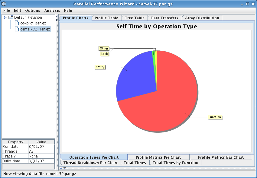
Figure 8.7: Operation types pie chart
Next: Analysis Menu, Previous: Array Distribution, Up: Frontend GUI Reference
This visualization provides a number of charts showing various graphical depictions of statistical profile data. These charts include the following:
For each of the charts, right-clicking the chart will bring up a menu allowing you to perform several operations on the chart, such as adjusting the display properties, saving it to an image file, or adjusting the zoom level.
Some of the charts deal with displaying information for regions of code. In cases where different callsites for a particular region can't be safely aggregated together (eg, nested ‘upc_forall’ loops), callsite information will be attached to the region name.
This chart is a pie chart that shows how much time your application spent doing different types of operations, such as time spent in locks, gets, or barriers.
See Figure 8.7 for a screenshot of this pie chart.
This pie chart gives you a very high-level view how time is spent in your program. It can be useful for determining if your application is compute-bound, throughput-bound, or has excessive calls to synchronization operations.
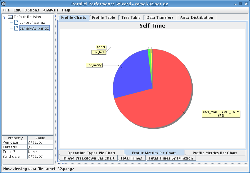
This chart shows profile metrics in the form of a pie chart, where each slice of the pie represents self time for one region of your program. Slices are included for the ten regions with the highest self times; the ‘Other’ region includes all other regions that do not fall in the top ten.
See Figure 8.8 for a screenshot of this pie chart.
Since this chart is based on self (exclusive) time, it helps you see the breakdown of the most costly individual regions of code where time spent can be attributed to that region alone. This can help you identify computationally-intensive region of code, such as poorly-tuned computation kernels.
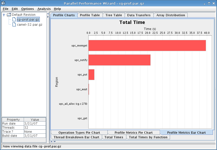
This chart is a bar chart in which the bars depict the total time spent in a given region of the user program. One bar is shown for each of the top ten regions in your program (sorted by total time).
See Figure 8.9 for a screenshot of this bar chart.
This chart helps you quickly pick out which regions are taking the most time in your program, so you can decide where to focus your efforts in optimizing particular regions. It also gives a visual indication of the relationship between different regions in your program, in terms of how much total time they take.
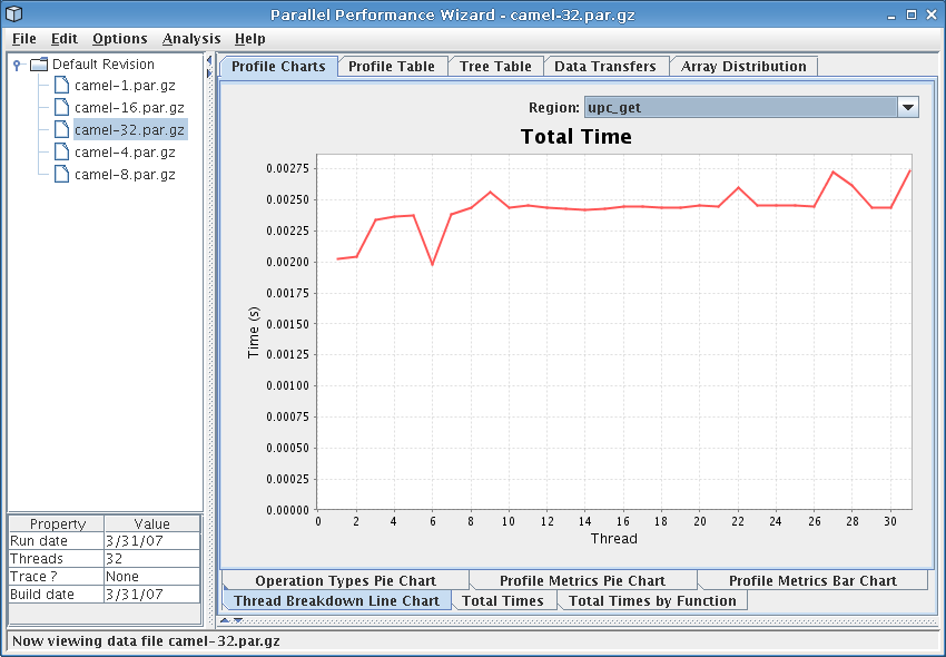
This chart shows a breakdown of the total time spent in a given region across the various threads in the system. The Region drop-down box near the top-right of the window allows you to select the region for which the chart is shown.
See Figure 8.10 for a screenshot of this chart.
This chart can be useful in identifying any load-balancing issues in your program. In a perfectly well balanced program, the time spent in a given region will be the same on each of the threads in the system. Thus, if you observe that one or more of the threads is spending significantly more or less time in a particular region than the other threads, you should investigate further to determine if this is the result of a load-balancing problem in you program.
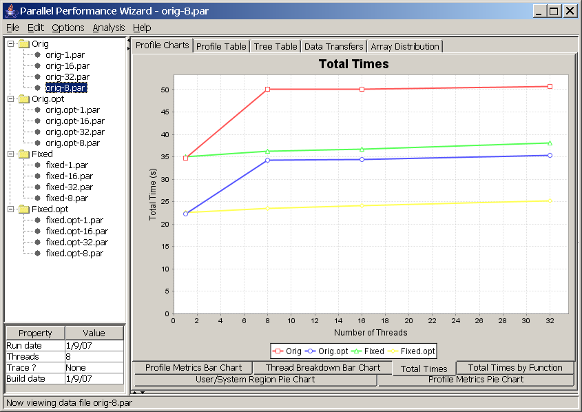
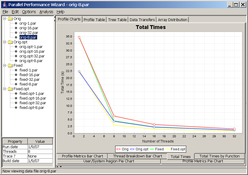
This chart allows you to compare different runs of your program across different revisions using different numbers of nodes.
In this chart, each line corresponds to a revision created in the open files list. Points for each line are obtained by plotting the number of nodes versus total execution time for each data file listed in a particular program revision. In other words, what you are looking at here is the classic time vs. nodes speedup chart.
See Figure 8.11 for a screenshot of this chart.
It is important to note that this chart is affected by the aggregation method option (Options -> Aggregation method from the menu bar). If you are using the default “summing” aggregation method in which displayed times are really a sum of all times taken across every node, then you would expect to have a perfectly straight line. For example, if your program had 100% efficiency and you ran your program on four nodes, then running it eight nodes should take half as long. However, since there are twice as many nodes, the sum of execution times across all nodes will be the same.
Therefore, to interpret the previous screenshot (see Figure 8.11), we see that the program does not have perfectly-linear speedups because the lines are not perfectly straight. Additionally, the big jumps between one and eight nodes of the “Orig” and “Orig.opt” revisions tell us there is a big drop in efficiency when moving beyond one node, but the efficiency doesn't seem to get worse as we increase the number of nodes. If we compare these lines to the “Fixed” and “Fixed.opt” lines, we see that these revisions do not exhibit the same efficiency drop as we move beyond one node, so whatever changes we made to those revisions has nearly eliminated the efficiency problem.
If you are using one of the non-default aggregation methods such as min, max, or average, then you will end up with a more traditional type of time vs. nodes chart. See Figure 8.12 for an example of the same data set from Figure 8.11 using the average aggregation method instead of the summing aggregation method.
For more information on how to set up program revisions, see GUI Overview.
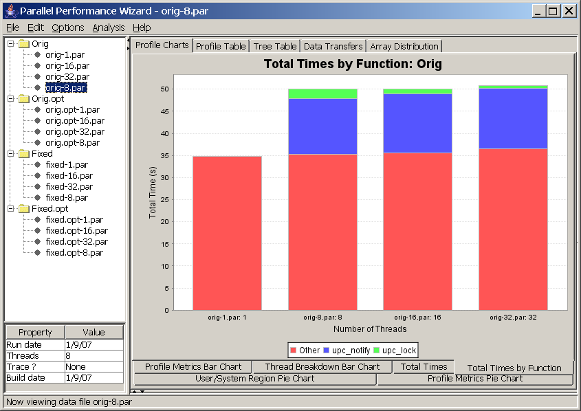
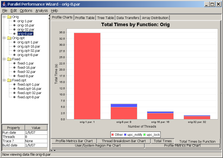
This chart allows you to compare runs of a particular revision of your program on different system sizes, illustrating how time is spent in the various regions (functions) of a program revision across different system sizes. This chart is similar to the previous chart, except that it shows a breakdown of time for regions within a program revision rather than time spent across all revisions. In essence, this chart “blows up” one particular line from the Total Times Line Chart and shows the breakdown of time for each run across different regions in your program.
See Figure 8.13 for an example screenshot of this chart.
As with the previous chart, this chart is affected by the aggregation method option (Options -> Aggregation method from the menu bar). If we are using the default “summing” aggregation, then we'd expect a perfectly-horizontal line as we increase the number of nodes. See the notes on the Program Speedup Line Chart for more information.
To interpret the screenshot in Figure 8.13, we see that the “Orig” revision of the program we're analyzing has a clear scalability problem when moving beyond one node. In particular, the time taken for the ‘upc_lock’ and ‘upc_notify’ regions (which are parts of UPC's barrier and lock language constructs) greatly jump once moving past one node, but the percentage of time taken for that lock operation decreases as the percentage of the barrier operation increases when increasing the number of nodes in the run. From this graph, we can determine that our example program has a lock contention issue that may be resuling in extra time spent in a barrier construct.
If you are using one of the non-default aggregation methods such as min, max, or average, then you will end up with a chart that is slightly harder to interpret and make good use of. See Figure 8.14 for an example of the same data set from Figure 8.13 using the average aggregation method instead of the summing aggregation method. For this chart, we recommend sticking with the summing aggregation method, although flipping between the min and max aggregation methods may shed some insight into where efficiency losses are coming from.
For more information on how to set up program revisions, see GUI Overview.