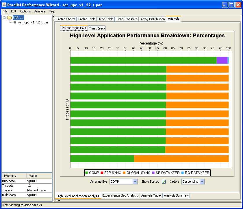
Figure 8.16: High Level Application Analysis visualization
Next: Jumpshot Introduction, Previous: Analysis Menu, Up: Frontend GUI Reference
PPW provides a number of visualizations that show the results of the various analyses offered by the tool. Within the Analysis visualization tab in the PPW GUI, the following are available:
Each of these is described in more detail in its corresponding subsection of the manual.
The High Level Application Analysis visualization shows a high-level breakdown of where time is spent in your application. Operations performed by the application are placed into several categories, including computation, global synchronization, point-to-point synchronization, outbound data transfers (sends or puts), and inbound data transfers (receives or gets).
See Figure 8.16 for an example screenshot of this visualization.
The visualization employs a stacked bar chart to show the time breakdown for each node, which is depicted using a color-coding scheme that assigns colors to each of the available categories mentioned above. A tab near the top of the display allows you to switch between Percentages and Times for the operation breakdowns. The Arrange By:, Show Sorted, and Order: controls let you change the arrangement and ordering of the display.
Left-clicking on a region in the bar chart will bring up a dialog showing detailed information for the corresponding category. Also, if you right-click on the chart, a pop-up menu with various options will appear.
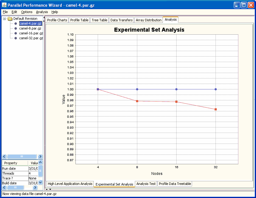
The Experiment Set Analysis visualization shows the results of scalability analysis by plotting the calculated scaling factor value for each experiment within the current experiment set against the ideal scaling value.
See Figure 8.17 for an example screenshot of this visualization.
Within this visualization the blue line represents the ideal expected scaling, while the red line shows the observed scaling.
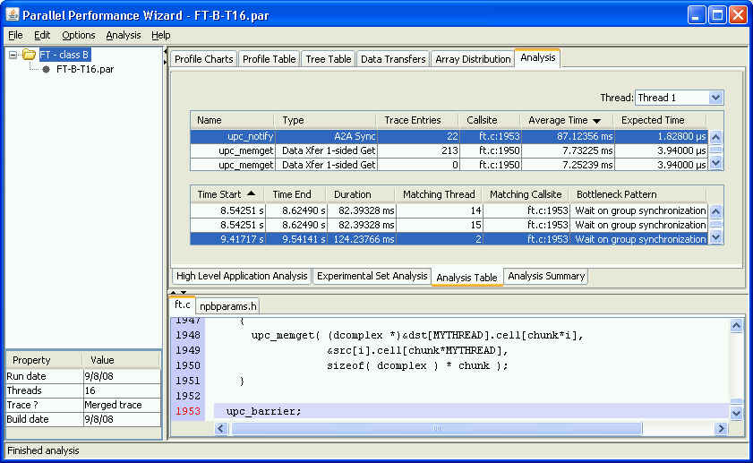
The Analysis Table visualization can be considered the most important view of analysis results. The display is broken down into two tables, along with source code shown below.
See Figure 8.17 for an example screenshot of this visualization.
The upper table contains profile analysis entries, which are the results of the profile analysis process. Each of these entries corresponds to a single potential problem location, as identified using either baseline or deviation comparison. For each of these entries, the table contains the name of the operation associated with the entry, the operation's type, the callsite where operation appeared, the various time values for the entry, and the number of associated trace analysis entries. Left-clicking on an entry in the table causes the lower table to show any trace analysis entries associated with that profile analysis entry.
When available, trace analysis entries corresponding to the currently selected profile analysis entry (in the table above) are shown in the lower table of the Analysis Table visualization. These entries are the results of detailed analysis using trace records and basically correspond to individual bottlenecks that occurred in the application. For each of these, we show the start time, end time, and duration of the bottleneck event, the matching thread and callsite with which it is associated, and a description of the pattern of the bottleneck.
The Analysis Summary visualization provides a high-level summary of analysis results in a simple textual form. This includes basic information on whether or certain kinds of analysis data are available, along with a listing of profile analysis entries for each program thread.