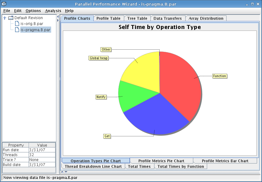
Figure 4.1: Operation types pie chart for the IS benchmark
Next: Generating Trace Data, Previous: Tweaking Instrumentation and Measurement, Up: Top
Once you've tweaked the instrumentation and measurement for the IS benchmark, run the benchmark again using the ppwrun command as described in The Initial Run. Transfer the resulting data file to your workstation, and open it up with the PPW GUI.
The first thing you should see when opening the file in the GUI is the operation types pie chart, which is also shown in Figure 4.1. This pie chart shows how much time was spent doing different types of operations at runtime over all nodes in the system. Of particular interest here is the fact that more than 60% of time was spent doing notify operations (part of a barrier), get operations, and global heap management operations.
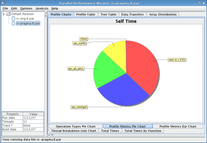
If you switch to the profile metrics pie chart by clicking on the bottom row of tabs, you should see a display similar to that in Figure 4.2. This shows us similar information to the operation types pie chart, except that it displays data in terms of particular language operations rather than generic classes of operations. From the figure we see that the ‘rank’ function comprises most computation time for our application, but calls to ‘upc_notify’, ‘upc_all_alloc’, and ‘upc_memget’ account for a large fraction of execution time. We need to keep this in mind when hunting through our data set to identify performance issues.
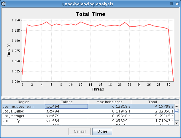
One novel feature provided by PPW is its load-balancing analysis, which you can run by accessing the “Analysis” menu bar. After the analysis runs, it will display a dialog similar to that shown in Figure 4.3. The analysis picks out lines of code where the time spent executing varies a lot from node to node, then displays these lines (sorted by severity) alongside a graph showing how time for that particular line of code was distributed among all nodes in the system. Looking at the figure, we can easily tell that calls to ‘upc_reduced_sum’ end up taking longer on threads 1-30 but not much time on thread 0 and 31.
In addition to the load-balancing issues with ‘upc_reduced_sum’ function itself, a call to ‘upc_all_alloc’ within that particular function also had load-balancing problems. The ‘upc_all_alloc’ function, as its name implies, is a collective routine requiring participation from all threads before the call will complete. Since the first and last thread spend the least amount of time executing this function, this means that all of the other threads wasted time waiting for these two threads to catch up to them. This explains the large slice for ‘upc_all_alloc’ we saw in the profile metrics pie chart visualization.
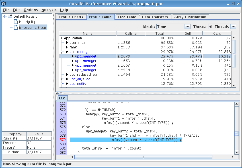
Moving on to some of the other visualizations, selecting the profile table visualization (in the tab row on the top of the GUI) should bring up a screen similar to Figure 4.4. The profile table reports flat profile information, similar to what you'd expect to see from a tool like gprof. However, unlike sequential tools, PPW aggregates data from all threads in the run together to show you an overall summary of how time was spent in your program, and will group similar operations together instead of showing a flat table.
From the figure, we see that the call to ‘upc_memget’ on line 679 accounted for nearly 30% of overall execution time, which explains the large slice for ‘Get’ operations we saw in the operation types pie chart. (You can switch on the percentages display by choosing it from the “Options” menu at the top of the GUI window.) Inspection of the code around the ‘upc_memget’ callsite shows it is from an all-to-all operation implemented with several calls to ‘upc_memget’. Furthermore, this callsite also shows up on our load-balancing analysis as having an uneven distribution on all nodes, so this particular all-to-all operation could benefit from further tuning.
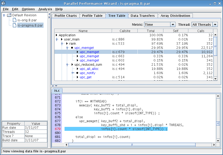
Finally, the last stop on our whirlwind tour of PPW's main visualizations is the tree table, which you can access by clicking on the tab row at the top of the GUI named “Tree Table.” For the IS benchmark, you should see a screen similar to the one shown in Figure 4.5. The tree table is very similar to the profile table we discussed above, except that performance information is shown in the context of function calls rather than as a flat list. This visualization allows you to “drill down” through your application's call tree, adding contextual information to the performance data.
Examining Figure 4.5, we see that the rank function accounts for nearly all of the benchmark's execution time, of which nearly 30% of time can be attributed to the problematic call to ‘upc_memget’ that we previously identified. Additionally, we see that the call to ‘upc_reduced_sum’ is indeed being hindered by the collective call to ‘upc_all_alloc’, as we previously hypothesized.
One useful feature of both the profile table and tree table is that you are able to double-click on any of the rows to bring up a window that shows how time for that particular row was distributed among all threads. This can be useful for eyeballing how a particular operation was distributed among all nodes in your system.