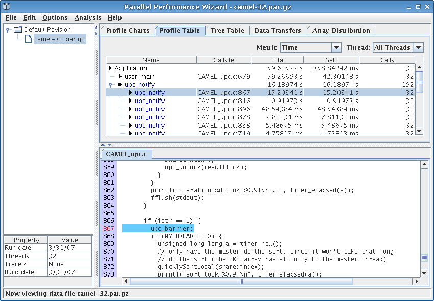
Figure 8.3: Profile table visualization
Next: Tree Table, Previous: GUI Overview, Up: Frontend GUI Reference
The profile table visualization provides a tabular view of statistical profile data for all regions of a program. The table shows data for one metric at a time, with ‘Time’ being the default metric to show. The data is either for a single thread or for ‘All Threads’, as selected using the Thread drop-down box. If ‘All Threads’ is selected, then the current aggregation method as specified in the Options > Aggregation Method menu is used to aggregate the data across all threads. To see how metric values for a particular region of code are distributed across all threads, double-click on that region to bring up a graph illustrating the breakdown of the selected region across all nodes in the run.
See Figure 8.3 for a screenshot of the profile table visualization.
The following columns are used to show the profile data:
If a region has multiple callsites, PPW may group these together if the callsites can be grouped together without affecting the interpretation of the performance data. By clicking on the tree controls in the first column of a grouped entry (which will have no entry in the ‘Callsite’ column), you can hide or show the callsites that were grouped together for that particular region. Entries in the table corresponding to a single callsite will have a right arrow icon next to their region name, while grouped entities will show a circular icon. For example, in Figure 8.3, PPW has grouped all calls to ‘upc_notify’ underneath a single generic ‘upc_notify’ entry.
Right-clicking on any column header will bring up a menu allowing you choose which columns from among those listed above you would like to see in the table. By default, only a few columns are shown.
Each entry in the profile table is coded with a color to describe the class the entry falls into. The colors used are:
If a particular region is flagged in red, that means the average time taken to execute this region is low enough that tracking performance information for each call to this region might add too much overhead to give you an accurate idea of this function's effect on overall execution time. In other words, PPW might be overestimating the actual time taken for this region in an unprofiled run. Future versions of PPW may include an overhead compensation feature that attempts to compensate for any perturbations caused by executing PPW's own measurement code.
If you find that PPW severely perturbs your application's performance characteristics, please see Managing Overhead for tips on how to reduce PPW's performance footprint.